Flagtag
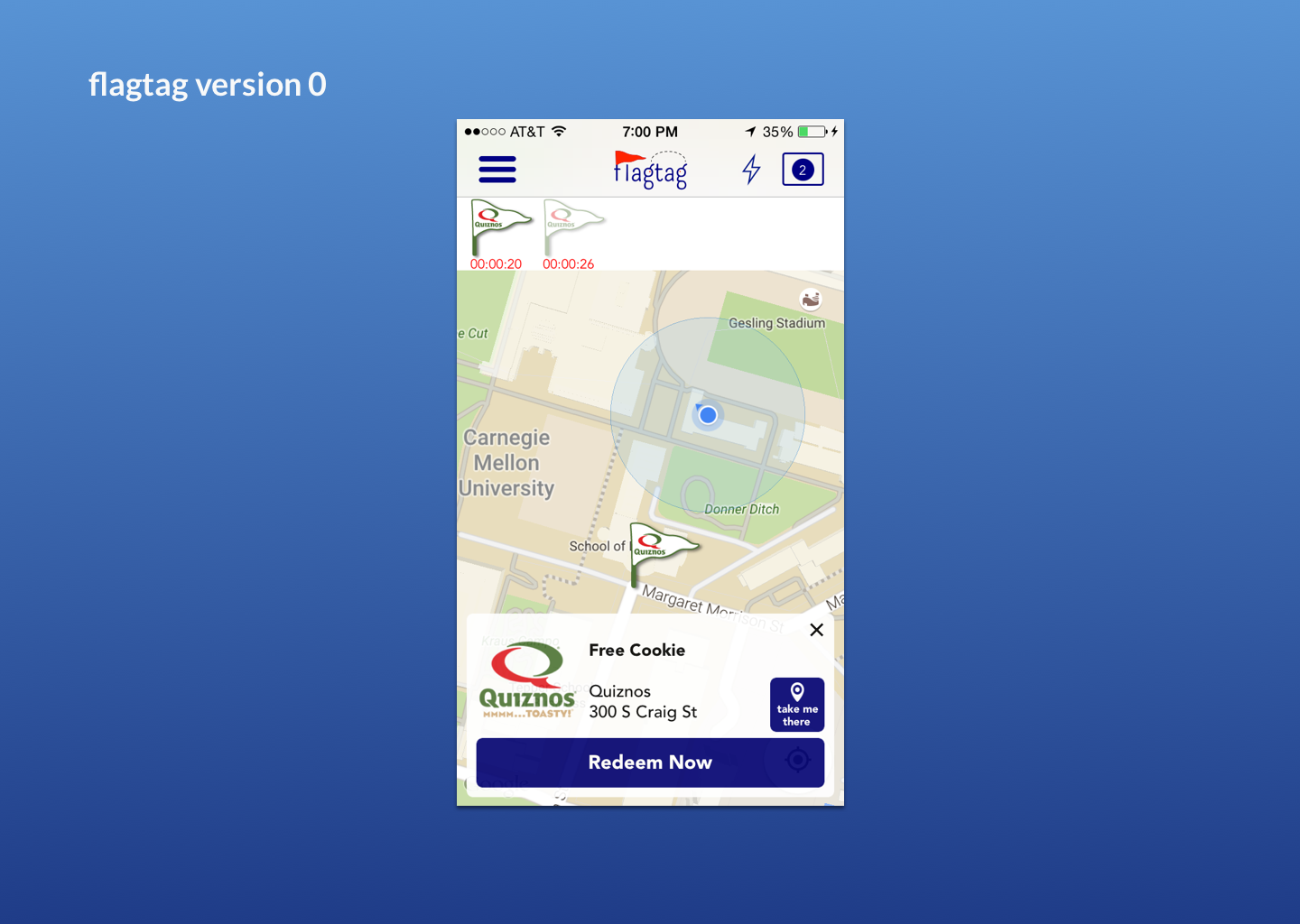
Flagtag is a mobile platform where local businesses offer deals for people to capture according to location. Think Pokémon GO, but instead of capturing Pokémon, people can capture a buy-one-get-one deal at Quizno’s. As the startup’s design and technical co-founder, it was my task to design and implement a mobile application our users could understand in a pre-Pokémon GO world. This mobile application was used by 20 businesses including Quizno’s and Dunkin Donuts, as well as hundreds of college students. Our company participated in Alphalab, a nationally-ranked accelerator, and raised seed-funding.
My Role
In this case study I will focus on using design to improve key user interactions in our mobile app that drove business needs. This helped us reach our outcome of having a 28% first-time flag redemption rate, four times better than the deal redeem rate we found from our business customers.
Full-Stack design
I designed the UX and UI of our mobile application, as well as crafted and executed research.
CTO
I managed the process of our development team, designed our architecture, and developed the backend of our technology.
Co-founder
I balanced design and tech with business decisions, injected a testing mindset of prototyping and research into the life-blood of our startup.
Team
7 People (Engineers, Business co-founders, designers)
Objective
Through previous rounds of pilot testing I found that users had trouble learning the first time user experience, capturing deals and redeeming deals. These were key interactions as our flag capture rate and first-time redemption rate were key indicators of our business success. Gearing up for our application release, I decided that a redesign was needed to address these issues.
Improvement 1: Prioritizing interaction layers
In pilot testing feedback users reported it was not intuitive where the find the interactions of capturing and redeeming deals. Furthermore, in focused task-based tests I found that users took a long time to do these key interactions. I made it my goal to shorten the time it took for users to capture and redeem deals.
In order to prioritize the most important and instant actions, I prioritized interactions into three levels.
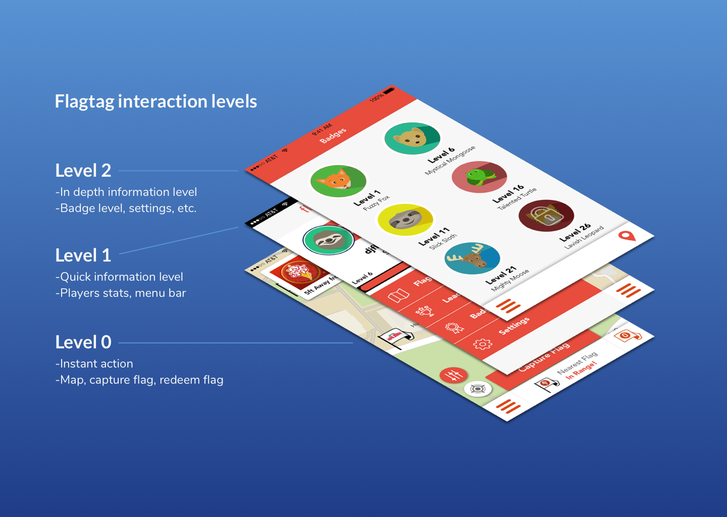
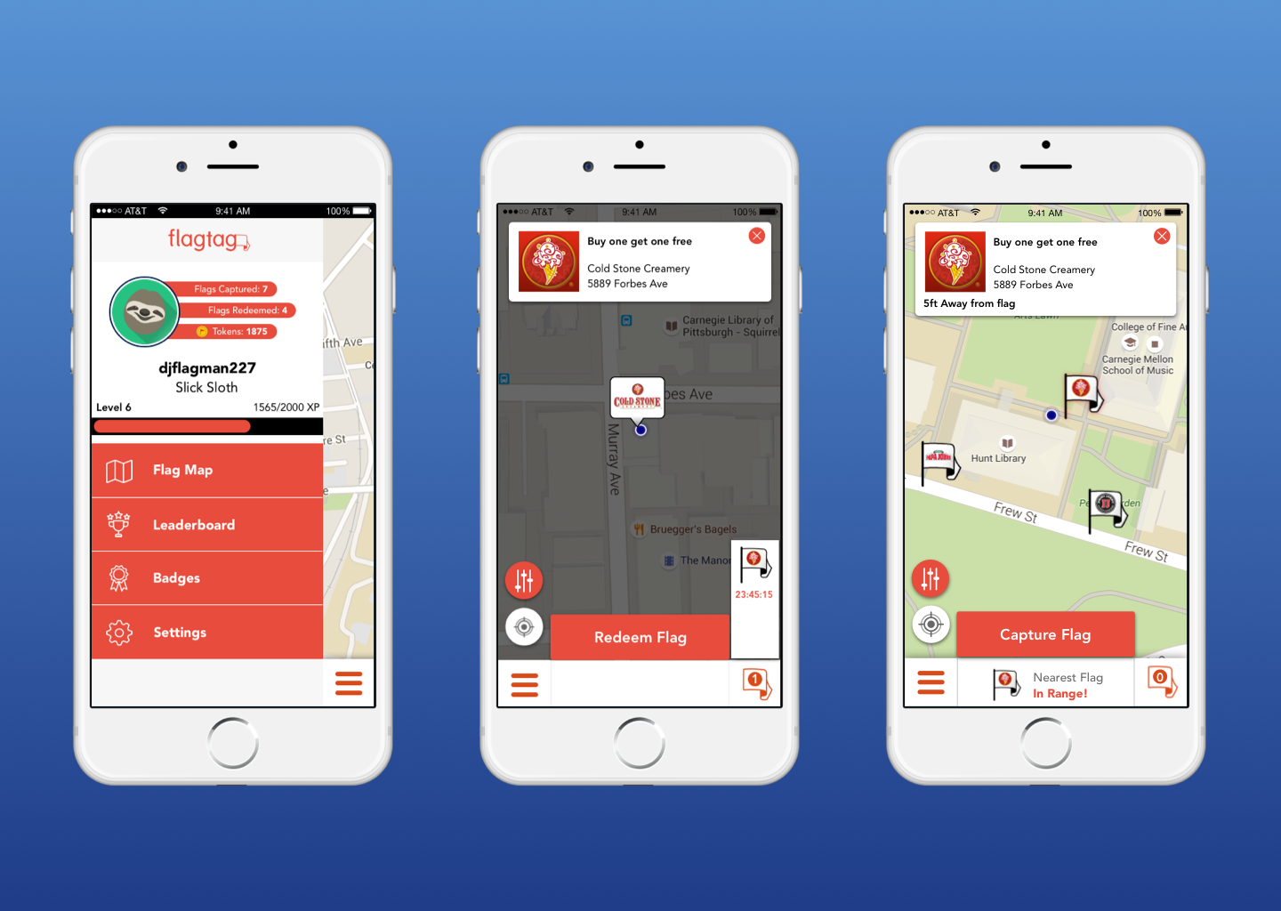
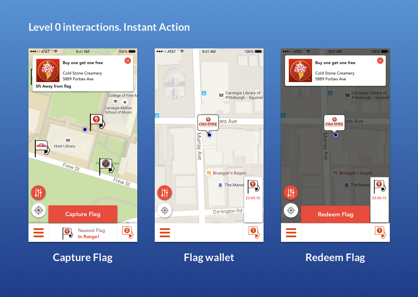
At Level 0, users need to take action as quick as possible. These interactions can be done in one click when opening the application. This includes the map to view nearby deals, capturing a nearby deal and redemption after a user has a deal.
Level 1 is the next layer of interaction our user may want to see when they have a couple more seconds of time. This includes their profile and the side bar for more in-depth information.
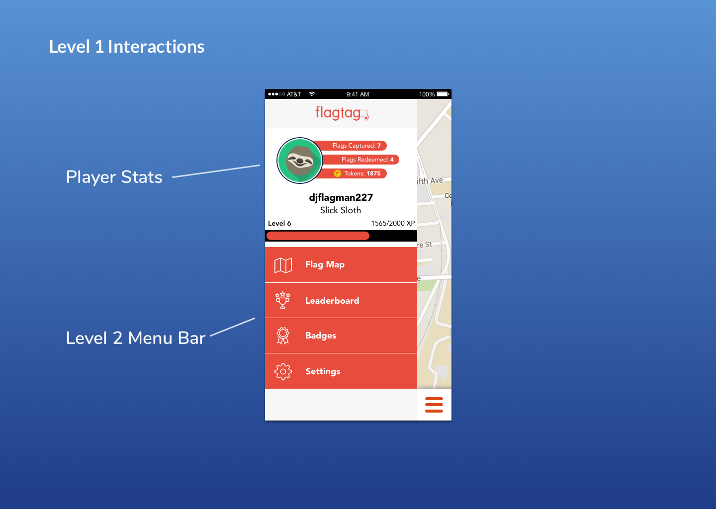
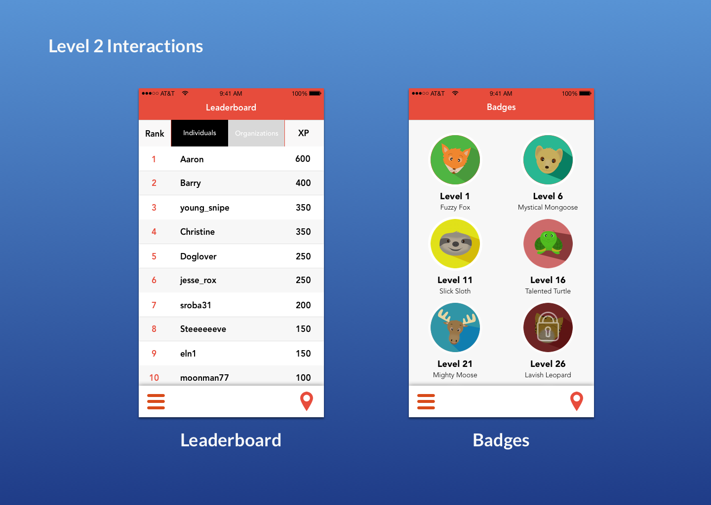
Level 2 is the most in-depth layer of information a user may need. They rarely need to check this layer but such details may be wanted when they want to check their progress or settings.
Creating this system helped to simplify a user’s cognitive load so that they only have a handful of actions to choose from depending on their situation. Having such a system also helped me so that I can quickly contextualize where to place new features, such as a legal page being placed in Level 2.
Improvement 2: Micro-interactions and animation
In order to quickly test new UI ideas for the application I created a mobile application out of paper. I went as far as printing out a map and moving it underneath a frame to simulate movement. Through this prototyping method, users gave me feedback that they had trouble knowing where to click buttons on the screen.
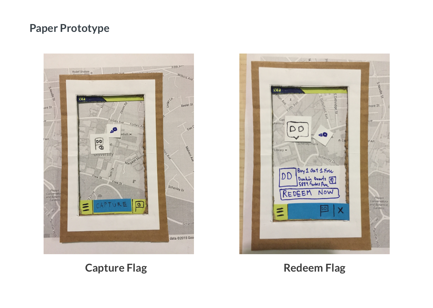
This feedback influenced me to place most interactions at the bottom half of the screen. According to (academic research)[http://uxmovement.com/mobile/why-mobile-menus-belong-at-the-bottom-of-the-screen/], the way smartphones are held and the large size of the screens make it much easier for users to interact with the bottom of a screen.
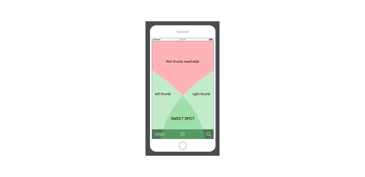
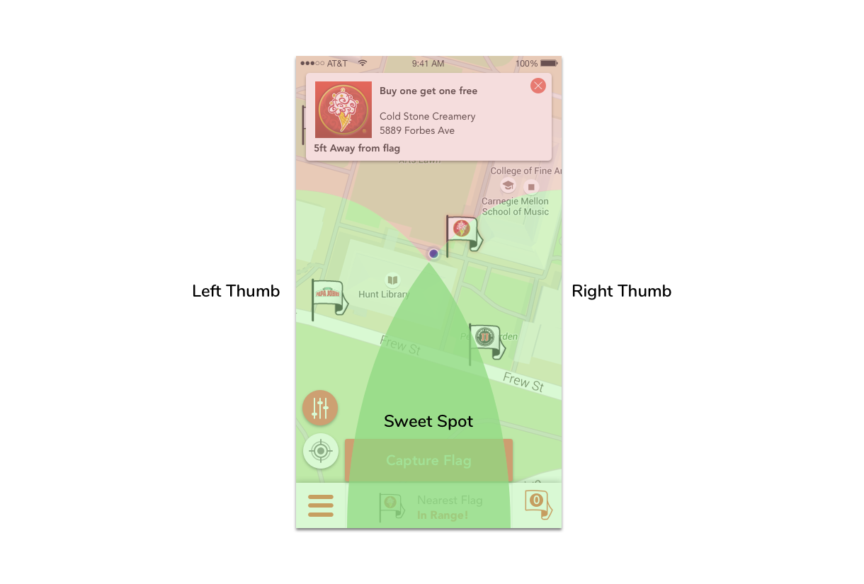
Specifically, the bottom center of the screen is the sweet spot for thumb presses, thus I decided to place the flag capture button at this location. Despite going against design norms, I went for this approach as I favored ergonomics. I also placed the menu button and redeem actions on the second best sweet spots on the screen.
As I further prototyped through using Balsamiq, I found that users didn’t receive clear feedback in the application when taking physical actions like walking in range of a deal or capturing deals. Due to this they weren’t sure if they had actually captured a deal.
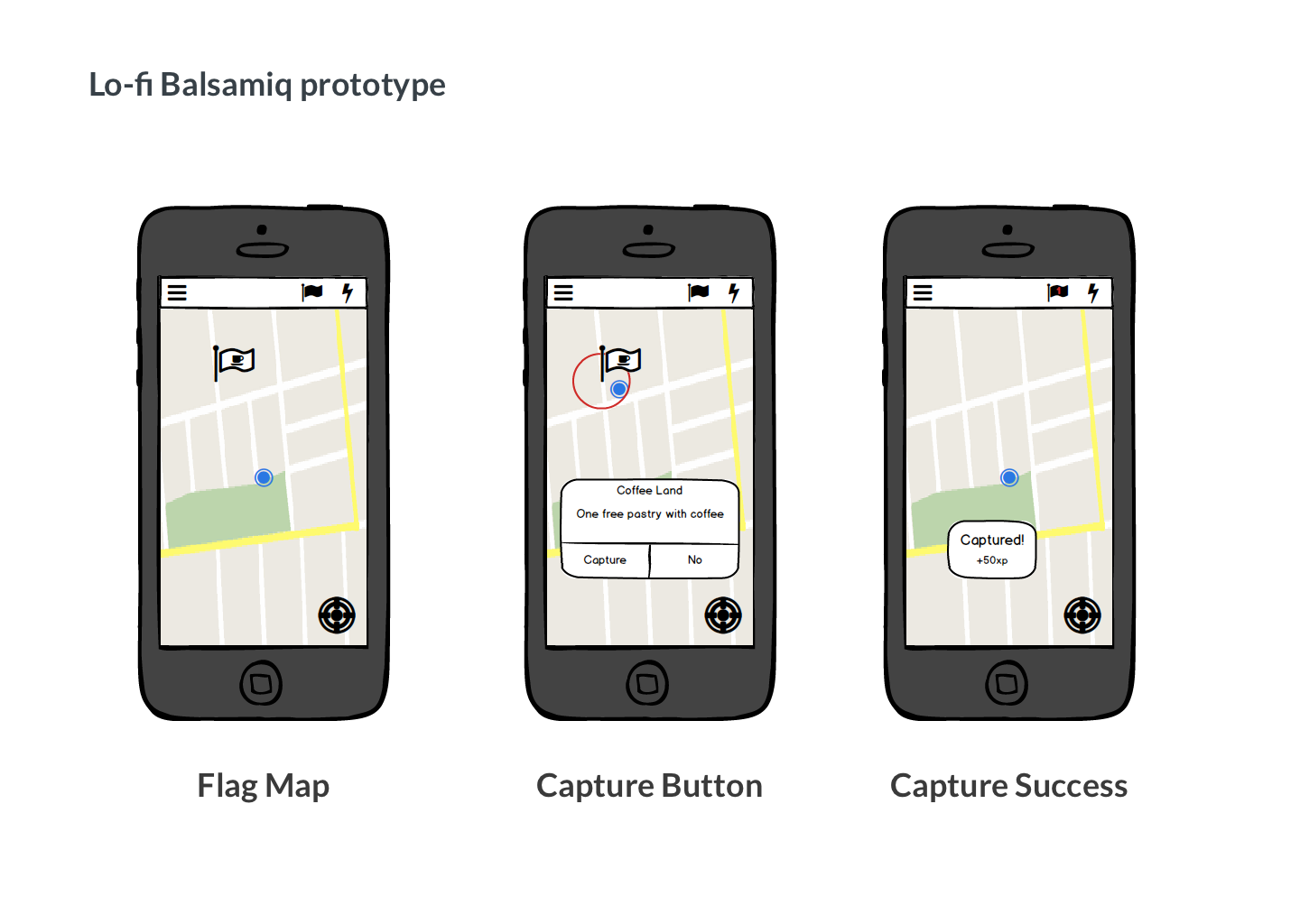
To improve this I designed animations and showed UI’s intentionally so that they gave noticeable feedback.
After implementing these changes users reported it was much clearer how and when to capture a deal. Some even reported a sense of fun when seeing such an animation.
“Picking up flags is fun, and I liked having different options for deals and locations,” Female, 21”
Improvement 3: Onboarding first-time users
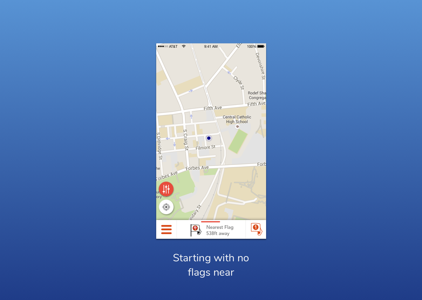
One of our biggest problems still was that users weren’t exactly sure what to do when they opened flagtag. They knew that they would be able to find some deals to restaurants around them but didn’t know how.
Some were greeted with a blank map of no deals.
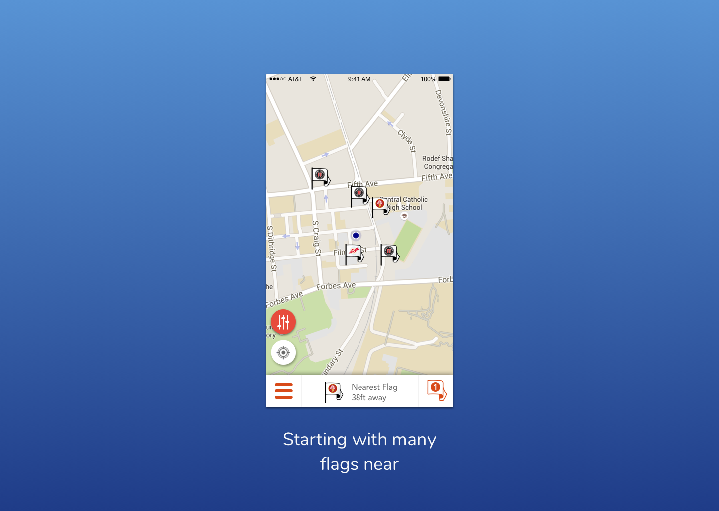
Others were shown a map full of deals but didn’t know how to grab them.
In order to remedy this problem I decided to plant a fake deal next to the user for them to take when first opening the app.
I thought this was a great idea, but users still did not get it fully. This sample flag actually threw them off about the point of the app, making it unclear if we offered deals or just flags. To fix this I decided it might be better instead to offer their first deal when opening the application.
This idea ended up going well as it incentivized users by easily giving them their first deal. It worked great for the local businesses we worked with as it gave them an immediate hook to grab customers as well.
Results
With my redesign users were able to pick up our application easier and do key interactions in a more seamless way. After implementing the new flag discovery and redemption flow in our pilot test, we reached a 90% flag capture rate and a 28% flag redemption rate. The 28% flag redemption rate is 4 times the standard rate in deal redemption we found from our business customers.
Through iterative tests I felt confident going into shipping my first product – using design to improve our ability to ‘capture’ our audience. The mobile app was shipped to over 20 businesses in the Pittsburgh area including Coldstone and Quizno’s, as well as hundreds of college students. Our company participated in Alphalab, a nationally-ranked accelerator, and raised seed funding.